The Problem: DTI's current site was built by a group of developers many years ago, thus, it lacks a lot of key information and can feel hard to navigate, especially for someone who does not have any background knowledge of Cornell's project teams. With its outdated information and look, DTI's site needed a redesign, giving the team a more functional site and rebrand in the process as well.

To start the redesign, we had to first evaluate the existing site, looking at key issues to address. After conducting user research, we found some main pain points:
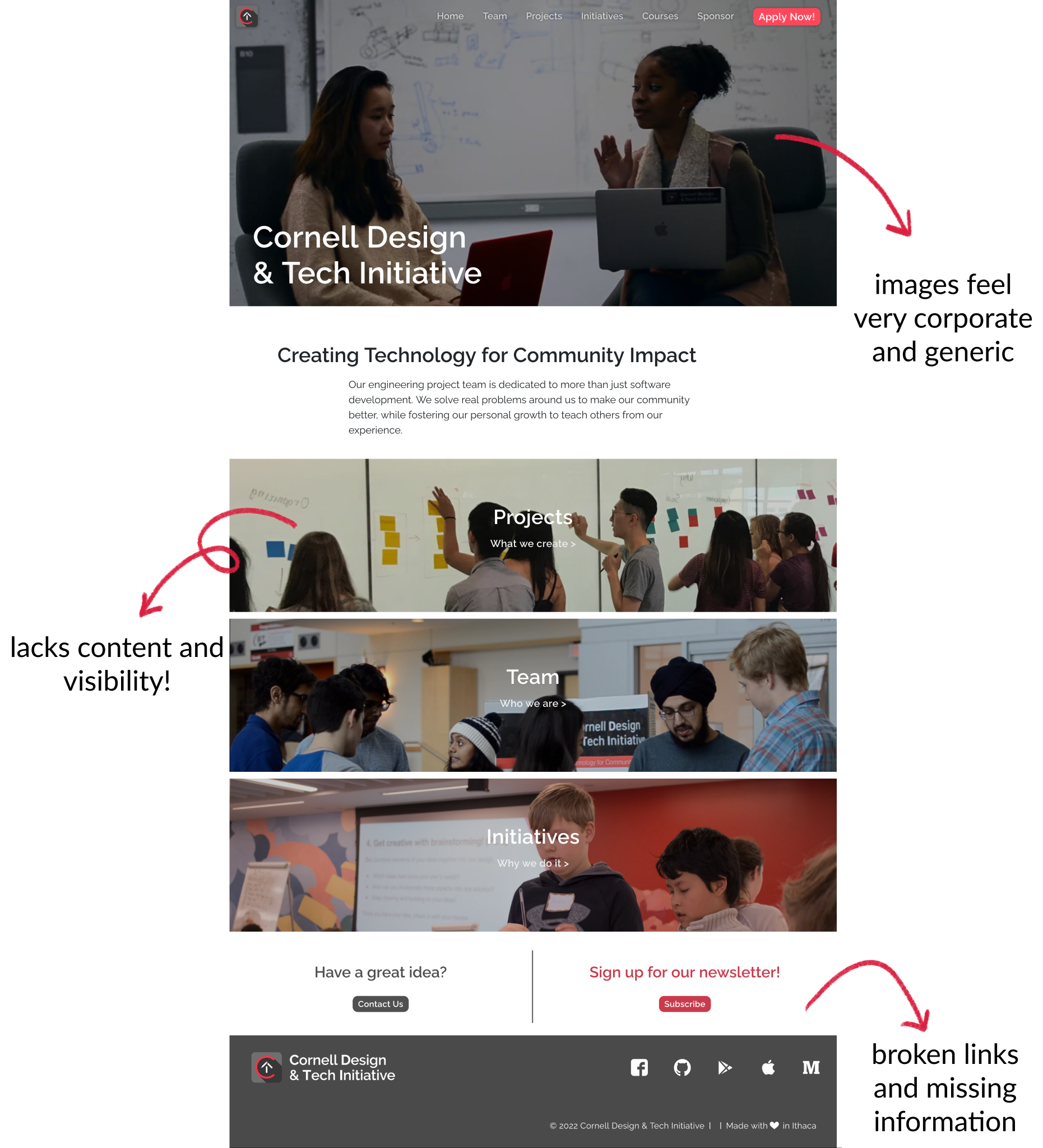
- Lacking information and context: Users found it difficult to understand what the team is about and how it differentiates from other engineering project teams on campus.
- Unorganized content: Users struggled to locate specific details due to it being missing or improperly structured.
- Appears generally unappealing: Visually, the site felt cluttered and unattractive to users, who found it difficult to understand the vibe of the team.
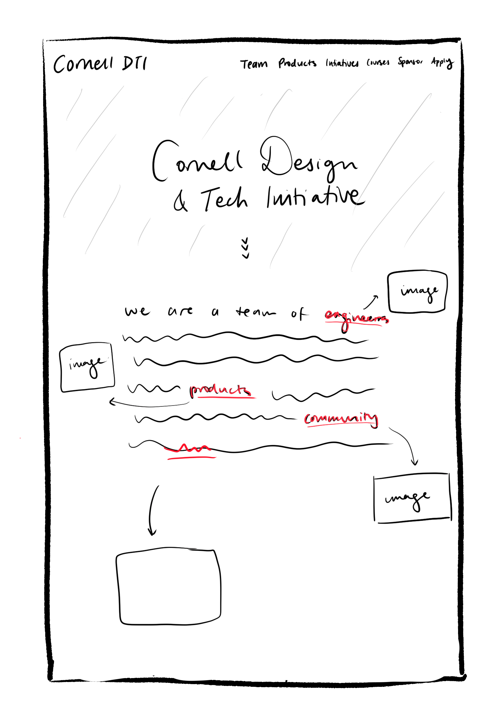
Hovering to reveal more information
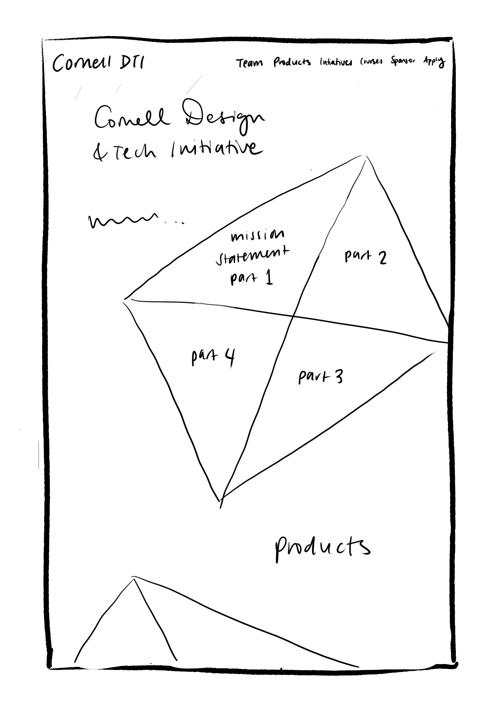
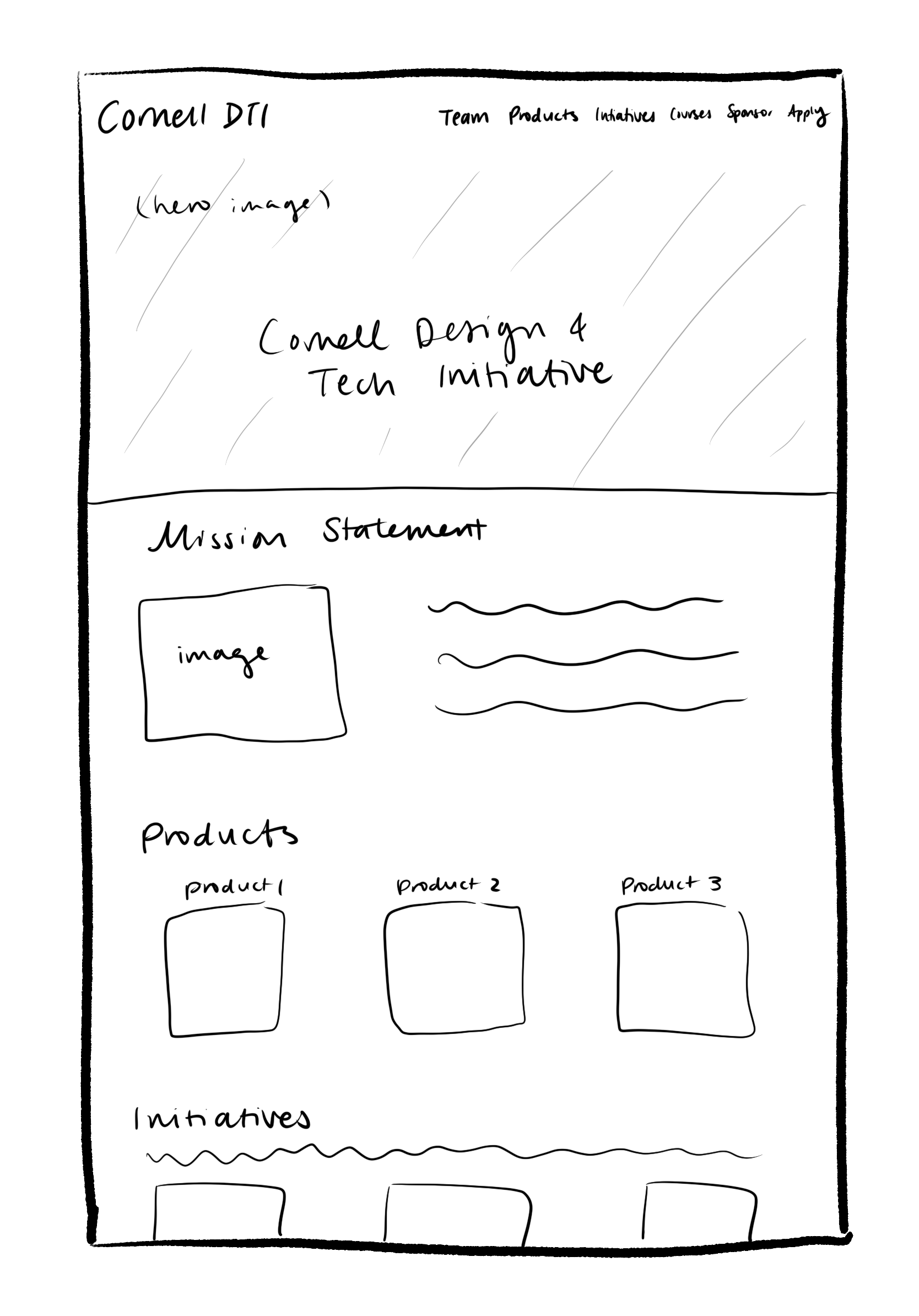
Experimenting with different layouts/interactions
One main piece of feedback from the team leads was to include more story-telling through our designs, especially since the home page is the first thing that a user sees, it should be interesting enough to keep their attention, while containing enough information that it reduces the need to click into other parts of the site. Since these initial sketches, we've continued to brainstorm and iterate on different designs, which we're still in the process of developing!